Monday, August 13, 2018

Stepped Terrace campus style

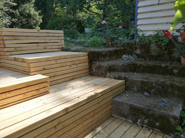
I did this terrace for a neighbour. She had photographs of a terrace on a university campus in the USA and liked it. In her garden was a small steep slope perfect for situating this kind of stepped terrace. Even so, there was a lot of hard digging work!


 The original concrete steps stayed in place, so I had to design the terrace around that.


There were a couple of design features. This is a 'table' area to lay out your picnic!


The devil is in the details. The slatted design for the verticals was a lot of work, I had to split the 2x4 planks into two, but the finished look is very sophisticated. Oops there is some warping going on there! maybe I'll replace one or two of those laths.


A very important safety feature: the tread of the steps had to be wide enough, or you find yourself stepping over the edge and risking a fall. I reduced the depth of the table area so that the step below was deeper.
You can see the second design feature here: the third step up is deeper on the far side at 80cm. This is the sunbathing platform!


As the terrace was on a slope I decided to use pile foundations. I drove twelve of these 3x3 posts deep into the ground. The end result is extremely solid; the terrace makes no noise when you walk on it, there is literally no bounce.


The frame almost complete, using 5x2 treated wood.


I added angular struts (not shown in the pictures) under the frame to triangulate the whole structure. This gave a lot of extra rigidity.


Sunday, July 15, 2018

Treehouse revisited


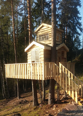
After a 30 year break, a chance to build another treehouse! First job was to choose the place. It was decided to use three trees, which presented a challenge. It would have to be flexible enough to accomodate for the threes moving independantly. I decided to use a clamping mechanism:

The spot. Not a bad place!

The working platform

One of the clamps

The deck nearing completion

The design of the house evolved naturally. The two large pines were quite close together, so I hit on the idea of a T-shape for the frame.


The perfect shape!


For the cladding we chose thick rough sawn boards of Aspen. It is very light and easy to work, and it weathers quickly to a beautiful silver gray.


The finished article, including happy customer!

Some details, including the great view through antique windows.


Friday, April 17, 2015

'Oranges and lemons said the bells of St. Clements.'

An orange and lemon tree? I couldn't decide wheter to do oranges or lemons, sooo... It came out really well I think, especially if you consider that the table top is only chipboard. There was also a nice moment of serendipity here; A lovely craquelure effect which arrived by accident due to using water based paints for the pictures and polyurethane varnish. The paintwork must have still been slightly damp. A rare occasion when hurry actually did something good!


Tuesday, April 14, 2015

The bells of St. Clements

Oranges and lemons on the same tree? Yes for sure, on a table. This came out amazingly well considering the table top is made from chipboard. I also got an amazing touch of serendipity here, using watercolour paints for the fruit and a polyurethane varnish I got some wonderful accidental craquelure! Next time I might even do it on purpose...


Friday, March 27, 2015

Lapland inspirations

My stay in Lapland, building log cabins from 'kelo' pine logs was inspiring. 24 hour sun, nature struggling to survive and adapting, quiet, emptiness. Magnificent.


Not often you have to beware of reindeer on a building site!


Blazing hot day and a faceful of sawdust. Heaven! Below, Osmo holds court at lunch.


I love working with the Kelo pine, it's actually dead wood, dry and filled with pitch, easy to work except for cracks. The pine tree grows in a spiral. The beautiful silver-grey colour comes from the fact that the pine tree dies,but stays standing, maybe for 50 years or more. The bark falls off and the wood surface weathers. The tree does not rot because lapland is a dry climate with very short growing seasons. Also it is not a windy place, so the trees stand like old fingers scraping at the sky.

I tried to make some kelo furniture which would fit into a modern home, so I reversed the wood, making a nice clean pale finish on the outside, and kept the natural surface inside, and making a little window into nature just using a 'puukko', a traditional Finnish hand-made knife, carbon steel, deadly sharp.

Raw materials:


Of course I had to have a go at chainsaw sculpting. I finished these with a sanding wheel on an angle grinder. I was especially please with the wolf cub.


And the finished article, with features, grey preserving wax and a home in the garden.


Tuesday, March 24, 2015

Water features

Finnish slate and granite are wonderful for water features. Here are two I did for my family members. Not a lot of carpentry involved, but plenty of creativity. The whole structure is built on large blocks of carved expanded polystyrene. The stones are fixed with, well I won't tell all my secrets!


The first one was massive, several tonnes of slate and a 2m drop, so the next one was an excercise in miniature, a trickling stream rather than a mountain torrent.  I found the beautiful 'strutsin muna' (ostrich egg) on a beach. I had hunted for a nice round stone for days, and finally found a beauty. Thank you to the ice-age! I drilled it and fitted the pump underneath. The pump has two pipes, the other one to the head of the little stream.


Friday, October 5, 2012

Chessboard coffee table / Shakkilauta kahvipöytä


Chessboard coffee table. Red oak / Punatammi block board, which I made from scrap pieces. Actually, because our paequet floor is English oak I waxed the table with several colour layers to make it look likw English oak, which suceeded well. The chessboard is of marble / marmori, coated with Epoxy resin. If I were to make it again I would leave the chessboard uncoated, because the resin has yellowed considerably in 5 years The close up on left shows the colour as it was originally! (little bit of Photoshop retouching) whilst the image above is how it looks today.

Bookcase and window seat / Kirjahylly ja istumapaikka


This is one one my favourite pieces, I had to build a book case and a matching window seat, in a Gothic style, as the house was built with a lot of Victorian Gothic features. I visited some old churches for inspiration, and came up with this design. It is made in chestnut / kastanja, a much underused, beautiful wood that looks very much like oak but is much easier to work